
Brand Values | Rostelecom
Overview
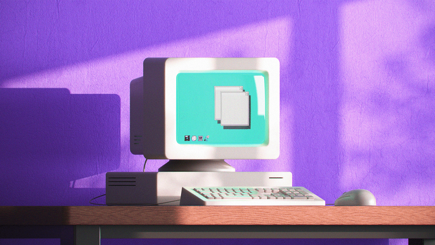
Rostelecom is the biggest provider of digital services in Russia. The company connects people across Russia through the largest telecoms infrastructure and services network in the country. During a major rebranding, cause of new business strategy and positioning of the company, the task was to convey to the company's employees the new values of the brand (manufacturability, development, simplicity, humanity).


As an art director on the client side, my objective was to produce a series of video manifestos that articulate the company's inner values, with the aim of motivating and inspiring employees. These videos were showcased on computer screensavers and common area screens, such as the lobby, dining hall, and recreational spaces.
Development
"Development" as a brand value:
Every day we strive to develop: by improving our products or by opening new ones. We are able to adapt and be flexible: thus, from a telephone company, we have become the largest provider of the Internet and are always ready for upcoming changes.
As an art director working on the client side, i collaborated with Petrick Animation Studio to create a video that highlighted the brand value "Development". My main role was to create a visual representation, or metaphor, for each statement in the manifesto. I also made sure that all the messages conveyed through the text were accurately and clearly communicated in the final product.
Production process

As development is all about discovering different and novel things, we decided to underline this diversity by using various visual techniques and styles in our project.
Visual metaphor for Smart Home solutions

Here’s an example from the company itself. Rostelecom is not only about telecommunications, but also Smart Home solutions. We show the whole process of development: from the idea and prototyping to the product and complete Smart Home solution.
Animation: Ilia Buzinov Design: Ruslana Mirzaalieva, Seva Vyvodtsev
We show the chaos that turns into the happy face as a symbol of the covered path: from disagreements to a complete understanding of each other.
Modeling Misha Petrick, Rendering Oleg Kulnich

New search - new ideas. Flipchart represents collaboration between people, where everyone can share anything - from initial flowchart to abstract art.
Design Ruslana Mirzaalieva Animation Pavel Borisov Rendering Oleg Kulnich


Cutting-edge technology is not the sole reason that improves us. There’s also personal growth. First, we show the Timelapse of technological advances. Then, we use familiar things like photos, decor, and awards to show how a personality is developed.
Modeling - Elena Dragun, Animation, rendering - Alex Petrovsky
Everything one needs for development is technology as a tool and people as a source.
Modeling Dmitry Gusset. Animation, rendering - Alex Petrovsky
In order to change something at any level (whether it is a person, a department, a company, a market or the whole world) one needs to develop constantly. We show an endless highway with numerous finish points.
Design - Russian Mirzaalieva Modeling, animation, rendering - Oleg Kulinich
Simplicity
"Simplicity" as a brand value:
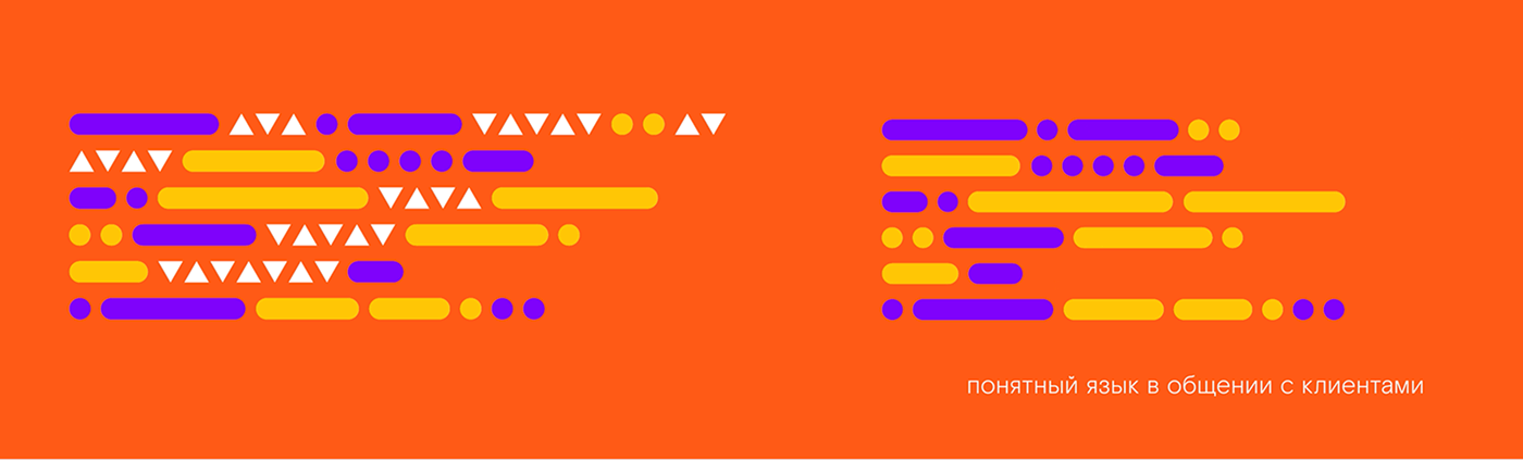
We strive to make our products and services as simple and understandable as possible for everyone. We avoid terminology, numbers, and technical jargon, communicating with users in their language.
As an art director working on the client side, i collaborated with eda agency to create a video that highlighted the brand value "Simplicity". My main role was to create a visual representation, or metaphor, for each statement in the manifesto. I also made sure that all the messages conveyed through the text were accurately and clearly communicated in the final product.
Visual metaphor for statement "instead of password phone number"

The most challenging task was to convey specific images, emotions, and qualities using abstract graphic interpretation, without icons or any specific images. In addition, a light background sound design was needed to help convey the idea that Rostelecom makes complex things easy to use.
Visual metaphor for statement "clear language in communication with the client"
Technologization
As an art director working on the client side, i collaborated with agency to create a video that highlighted the brand value "Technologization". My main role was to create a visual representation, or metaphor, for each statement in the manifesto. I also made sure that all the messages conveyed through the text were accurately and clearly communicated in the final product.
Humanity
The brand's commitment to humanity is expressed in its endeavor to listen to everyone: the company pays attention to requests and fellow citizens, approaching its work responsibly, valuing its reputation, and consistently offering customers universally high-quality products. The brand's reliability and appeal are ensured by the company's innovative forward movement and continuous improvement of their work.

The brand ideology, conveyed through the values mentioned above, pursues one main goal - to make the world of information and communication services simpler, more convenient, and accessible to everyone. Leveraging modern technologies, the company focuses on people – their interests, desires, and needs, aiming for the brand "Rostelecom" to be associated with a new, consistently high standard of performance and quality of life for them.

